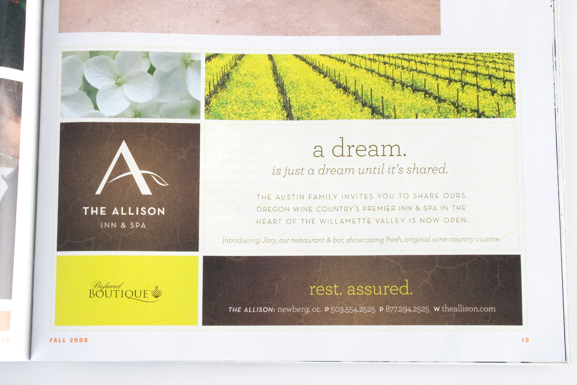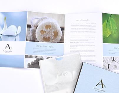
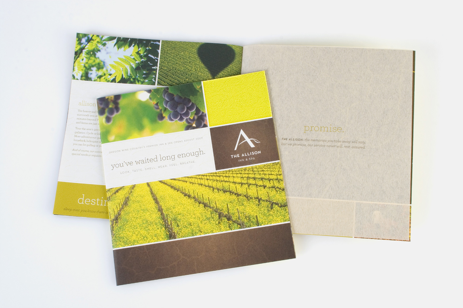
Branding and print collateral The Allison Inn & Spa
The Allison Inn & Spa came to us with a logo and asked us to come up with the rest. We shaped the brand to take on a friendly personality with a rich earthy look to represent the fertile soil of Willamette Valley wine country. As lead designer, I had a challenge ahead of me, as the Inn & Spa were still in the process of being built. All I had as reference were architectural drawings, the rest I created. I designed high-end brochure for both the inn and spa along with many print and digital needs including key cards, gift cards, menus, door hang tags, stationery, website, etc.
Role: Art direction & Visual design of print collateral & identity system
Designed at Hallock Agency for The Allison Inn & Spa


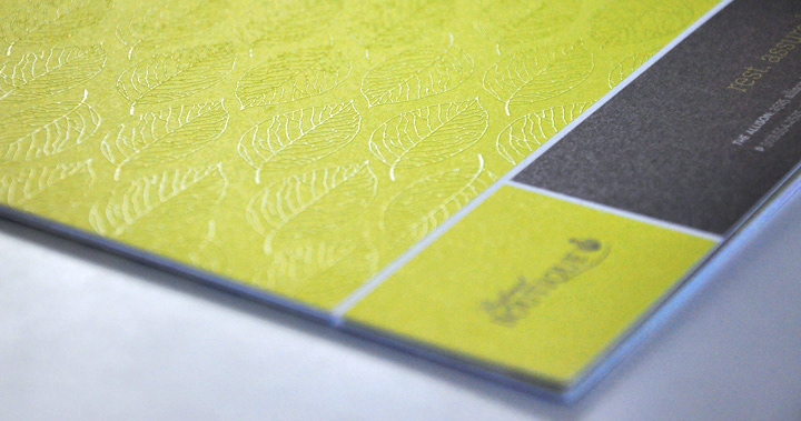
Detail: Clear thermography as patterned texture
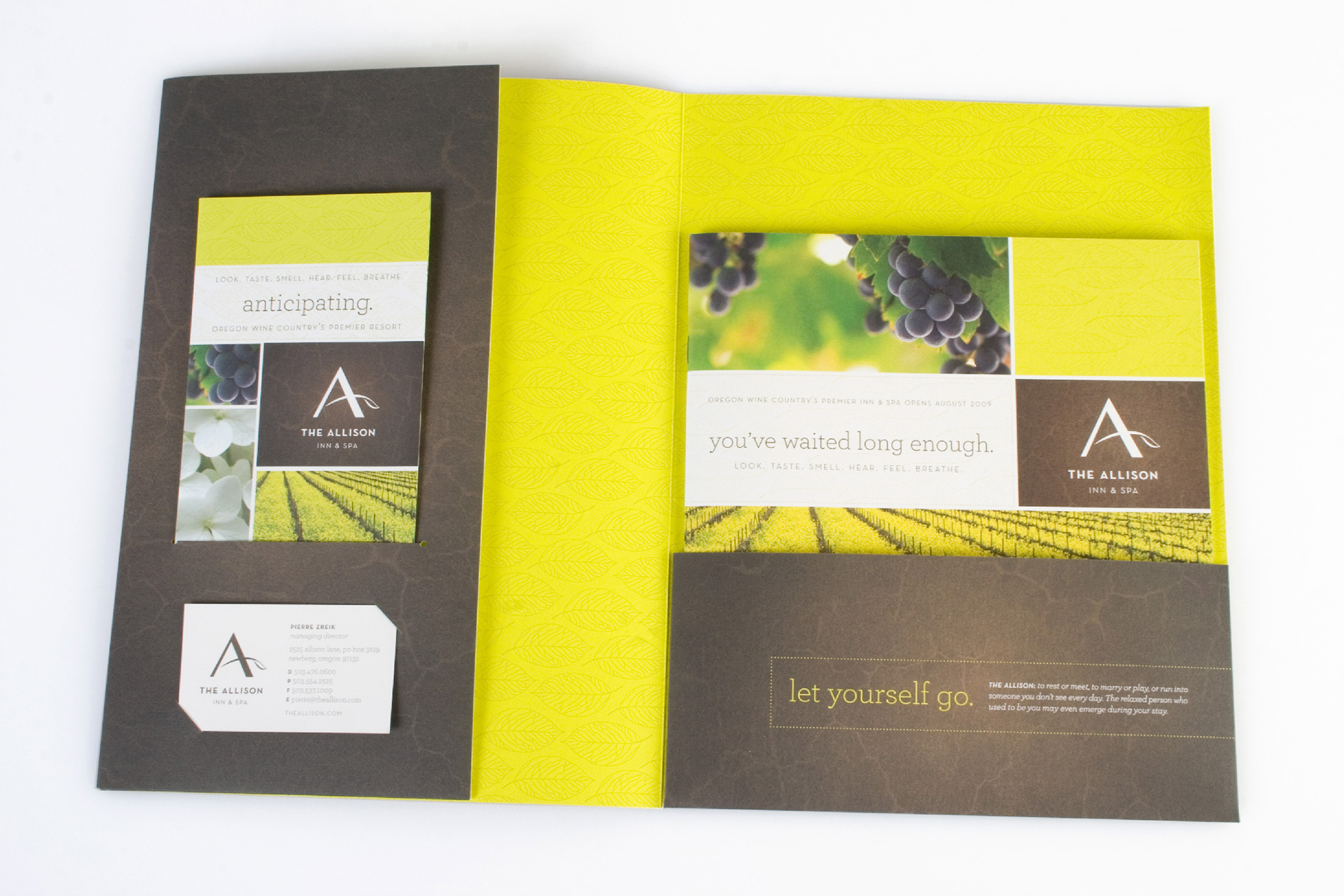
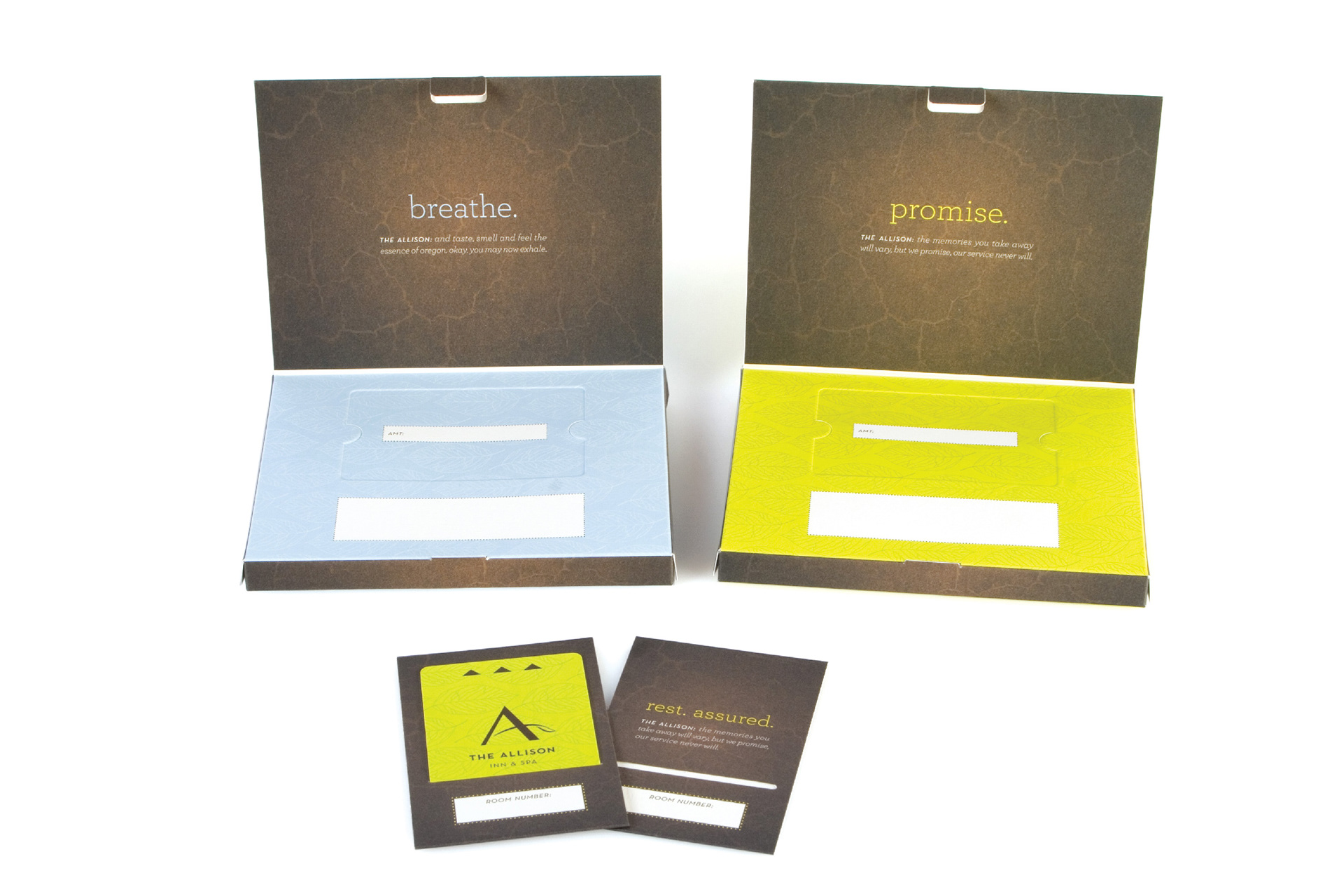

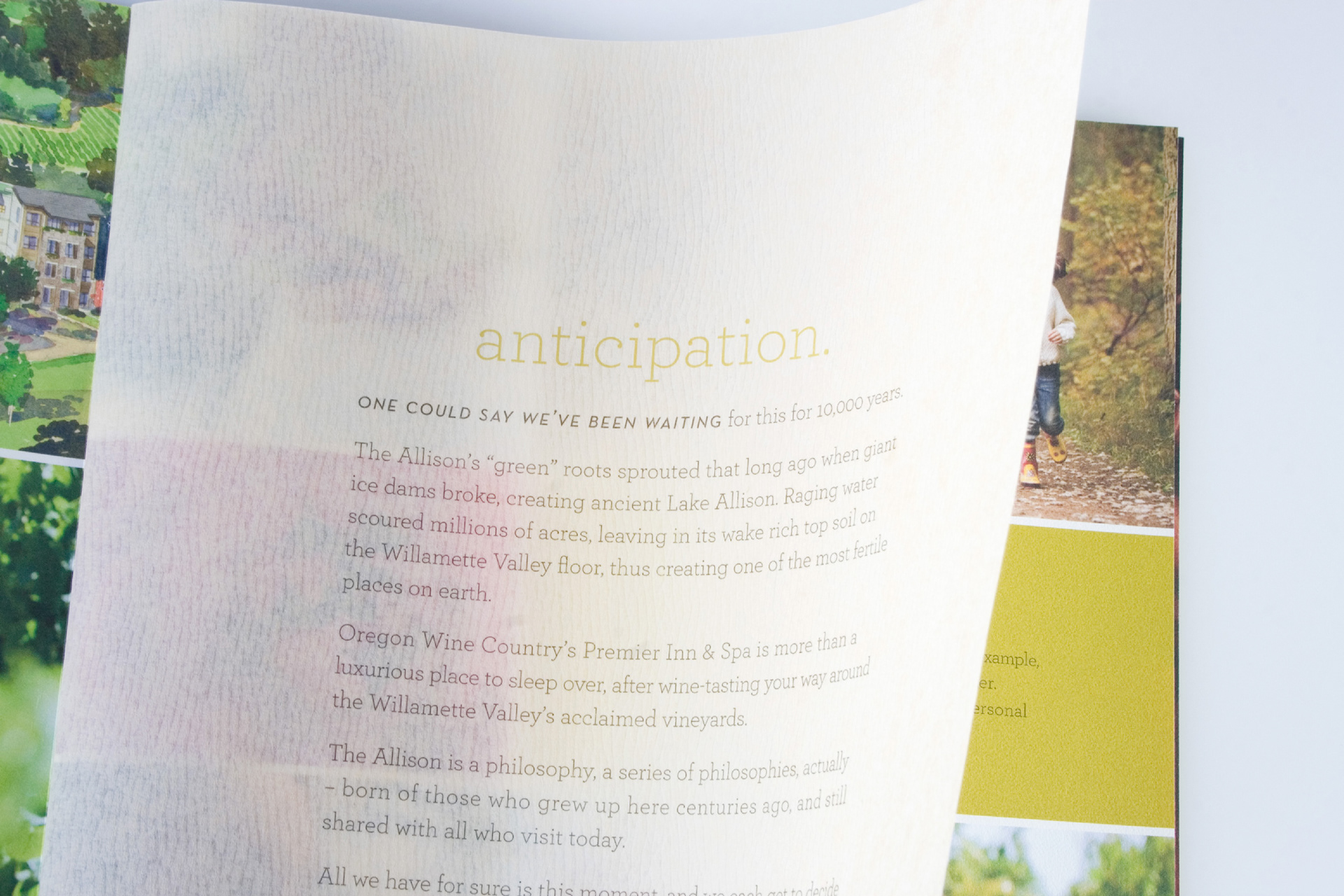
Each piece of stationery has a unique philosophy. Rich earthy textures were inspired by the story of the Lake Allison flood that brought rich fertile soil to the Willamette Vally.